Oh fall - such a great time of year. We love the richness it brings - the colors of the leaves, the crispness in the air, excuses to stay inside and bake, watching football - the list goes on. Fall almost has a texture. On that note, this year we have played with texture more than ever before. Today we are showcasing Jillian + Tommy's invitations [FINALLY]! I have wanted to share these for some time and since their September 19 nuptials have made this lovely couple official, feast your eyes!
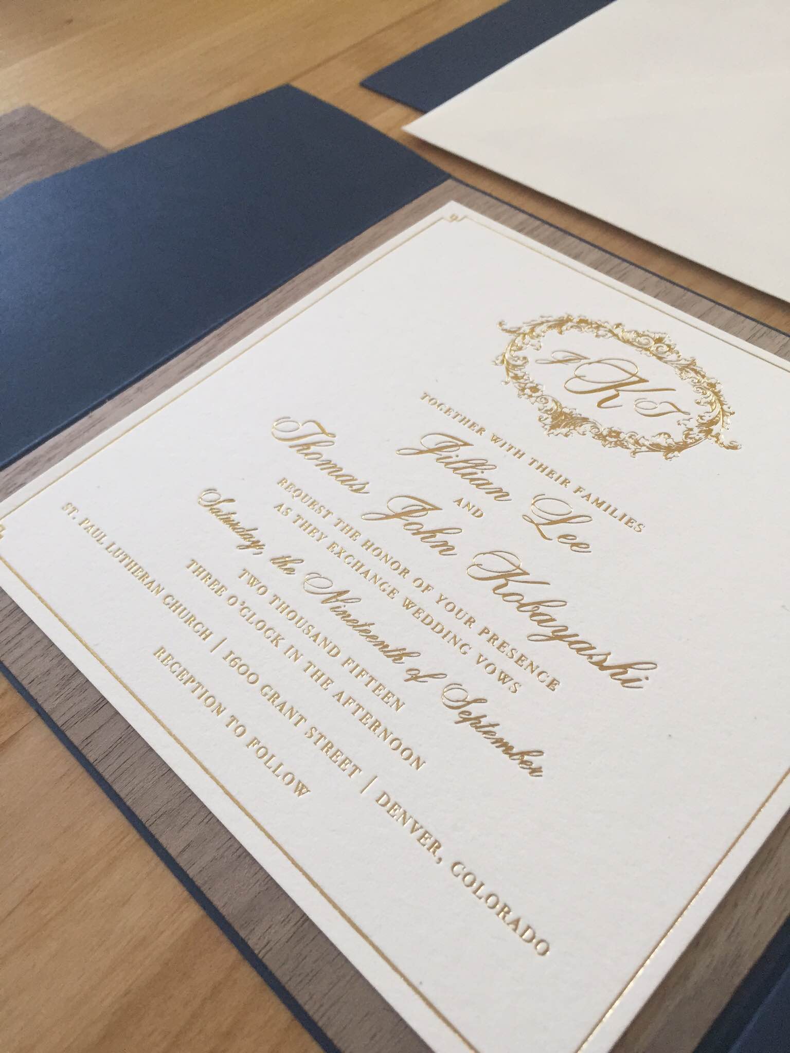
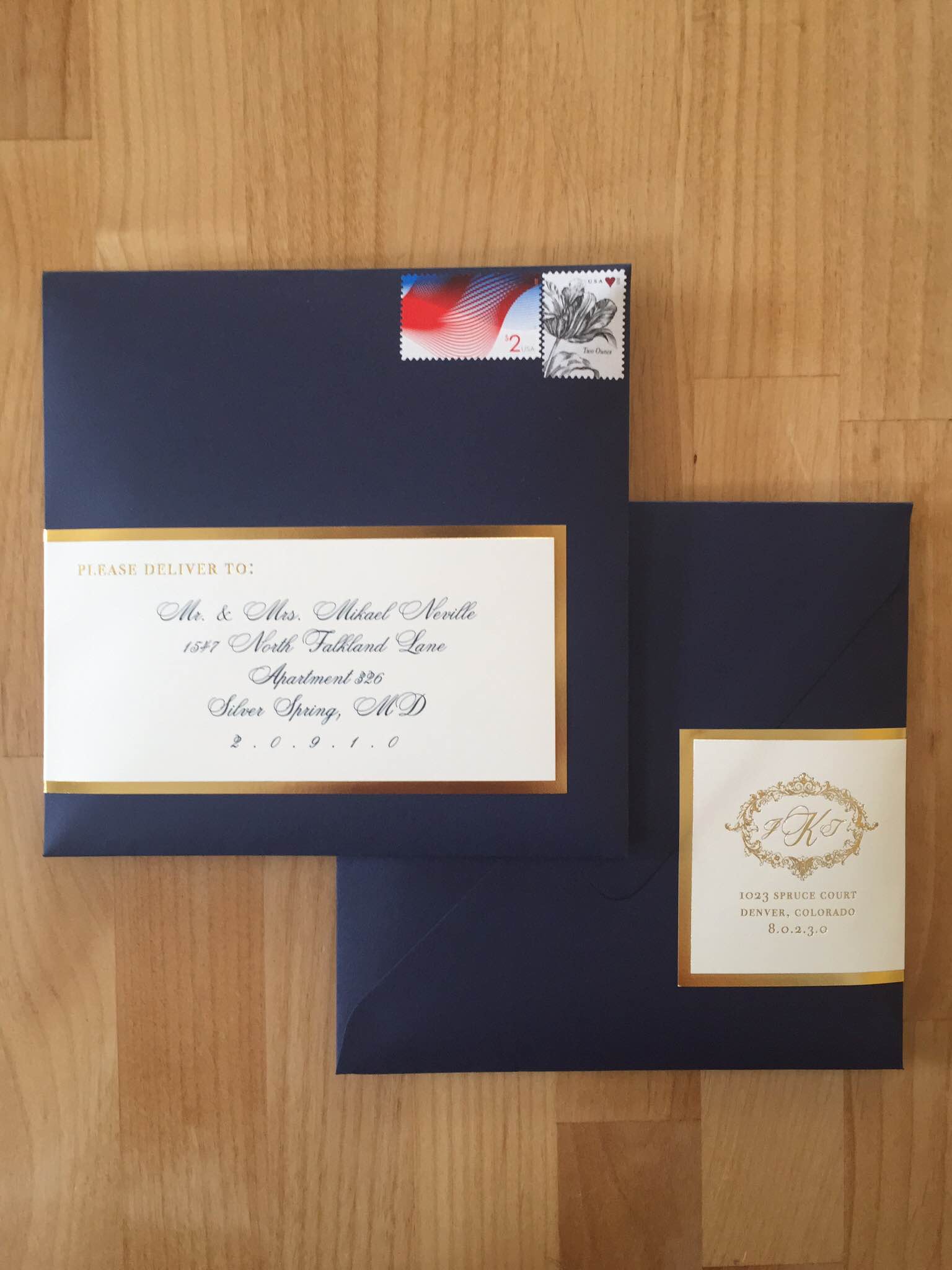
We used a lovely matte finish Navy pocket. Honestly, there's nothing like a matte navy. It's so luxe - you don't need any added sparkle. Add some navy velvet ribbon, walnut wood veneer, and cotton paper stock and you've got it made. Jillian + Tommy wanted a hint of rustic with their otherwise elegant, formal, and victorian style. The combination of floral liners and backers and the gold foil stamping set off the wood veneer accents perfectly, leaving guests with the wow factor that the couple was hoping for.
You all know about my love for a good monogram and luckily Jillian + Tommy felt the same way. We designed this beautiful crest for them and the couple included this foil stamped crest throughout the remainder of their printed pieces. This couple gets an A in my book for consistency (which is key to developing a cohesive look/feel for your big day).
Extra love to Ashley and Nicole from Ashley Nicole Events for their outstanding eye in planning and for bringing us such a lovely client.
Best wishes to Jillian + Tommy and a lifetime of only happiness!